
Tips on How to Optimise Your Website for Mobile Users
In 2021 the hard truth is that if your website isn’t optimised for mobile users, you will lose clicks, customers and cash.
That’s why at Total SEO Services we aim to help you understand and optimise your website for mobile users and thus boost your business in 2021 and beyond.
With this informative article we hope to equip you with all that you need to prepare, modify and strengthen your SEO strategy to thus lock down your mobile using customers and clients this year and for yeas to come.
What Is Mobile SEO?
Mobile SEO is the process of optimising your website to ensure that your site functions properly and looks inviting and engaging on mobile devices.
By implementing mobile SEO, you’ll create a more positive site experience to users since it will look appealing on a computer, laptop, tablet, or phone screen. This will thus increase and improve your universality, accessibility, audience perception and reputation.
Why Is Mobile SEO Crucial To Your Business Strategy?
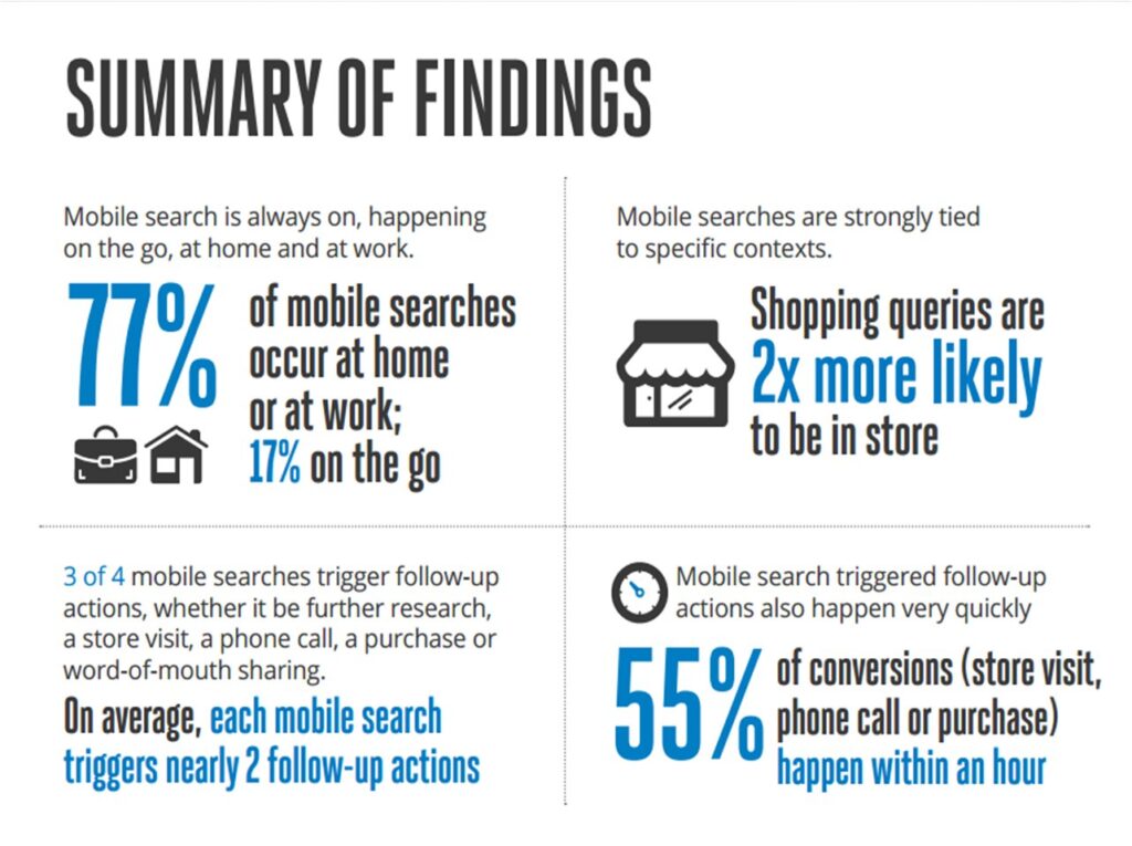
The use of mobile devices has soared over the past decade, culminating in 76% of consumer shopping on mobile devices. In fact this number is only expected to increase as smart devices become more and more accessible.
Yet many companies still don’t realise the importance of a mobile-friendly site. The fact of the matter is that if you don’t have a mobile-friendly website, it hurts both your SEO and your audience’s perception of your business.
52% of users are less likely to engage with your company again due to a bad mobile experience. Therefore, if you want to prevent bad mobile experiences, you must optimise your site to be mobile-friendly.
Useful Statistics That Demonstrate Why Mobile SEO Should Matter To You:
- People spend 70% of their Internet time on mobile: When users browse online, 70% of the time, they’re using portable devices to do it. If users spend the majority of their time using mobile devices to browse the web, you need to ensure they have a positive experience on your site. If you don’t adapt with the changing times, you risk falling behind, loosing customers and money all due to poor mobile experience.
- 74% of users are more likely to return to a mobile-friendly website: If users have a positive mobile experience on your site, they’re more likely to come back revisit your website and are therefore more likely to become a customer of your business.
- Mobile-friendly websites improve the opinion of more than 60% of users: A big part of mobile SEO is adapting your website to provide the best experience for your audience. If you don’t have a mobile-friendly website, you risk people having a negative perception of your business and leaving your website which in turn damages your SERP (search engine results page) ranking. By having a mobile-friendly website, you’ll improve the opinion of more than 60% of users that find your business.
- 67% of users are more likely to buy from a mobile-friendly company: Your mobile-friendliness impacts your conversion rate. If your site works effectively on smartphones, your audience is more likely to purchase products from your company. A mobile-friendly website will help you gain more clients and earn more money for your business.
How To Check If You Have a Mobile-Friendly Website:
Since 2019 Google has started prioritising mobile sites when crawling and indexing websites. Since more and more people use their phones to search the web, Google has shifted to a “mobile-first index.” This means that the search engine looks primarily at the mobile version of a website, considering this the “primary” version instead of the desktop version. Having a site that isn’t mobile-friendly will hurt your position on the SERP, leading to less traffic, fewer customers, and decreased revenue for your business.
Thus it is clear that it is in your business’s best interest to optimise your website for mobile users.
An easy way to test mobile-friendliness of your website is to use Google’s mobile page testing tool. All you have to do is enter the URL of the page you want to check and click “Test URL button”. Once your mobile-friendly analysis is complete, you’ll have a better idea of the work you need to do for your mobile SEO strategy.
In order to Ensure that Your Site is Mobile Friendly, You can turn to Total SEO Services for a Helping Hand.
We are a team of experienced and skilled SEO experts, determined to improve your businesses SEO. We especially want to help businesses recover and thrive after the blow of Covid-19 to businesses up and down the country. We can update or even build you an entire new website that is readable, user-friendly, and most importantly optimised for mobile use. This will mean that your website is more up to date, on trend and accessible, leading to increased use and consequently increased revenue.
To consult us at Total SEO Services and invest in a optimised, mobile-friendly website and content, visit https://www.totalseoservices.co.uk/ or call us on 01142 667 996!
Top 10 Ways To Optimise Your Website for Mobile Users
The Design Do’s:

Responsive Web Design Explained
1. Site Design For Mobile
Mobile devices are simplifying and revolutionising the ways sites are designed. Make sure your website is both functional and fun for mobile users.
It needs to be eye catching and engaging but not too cramped and full.
Find the balance for your mobile website and you’ll see immediate benefits of increased traffic and revenue.
2. Responsive Web Design
Responsively-designed sites use CSS3 media queries to serve the same content to mobile and desktop users using a fluid grid and a flexible design to automatically adapt to the size of a user’s screen.
Responsive designs use media queries to target the layout based on screen width, orientation, and resolution. By using responsive design you can guarantee that your website is optimised for any device that may wish to access your site, thus greatly improving your accessibility.
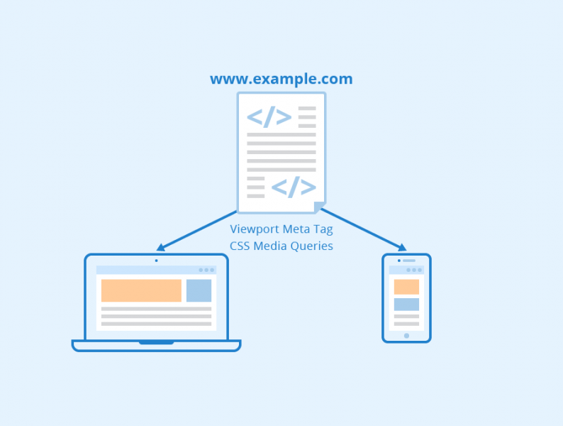
Responsive designs use media queries to target the layout based on screen width of the visitor.
3. Ensure You Design For Thumb Scrolling
Touch screen navigation can often lead to accidental clicks if your buttons are too big, too small, or in the path of a thumb that’s trying to get the page to scroll.
Take this into consideration when designing your page, test it and make sure that those using their thumbs to surf the internet can easily access and operate your website.
Follow Our Top Tips And Reap The Benefits of Mobile Optimisation!
4. Create Engaging, Frequent Content
In the modern, multimedia, mobile market place content is king. Therefore, when optimising your website and content for mobile users, make sure that you are posting frequent and engaging content. This will not only boost you up the SERPs but keep your customers engaged with your business and content.
This is an area in which Total SEO Services is ready and rearing to give you a helping hand. Our experienced team of content writers can produce tailored SEO content for your website. This user focused, optimised content is extremely effective as it is carefully designed exclusively to entice your potential clients.

Optimise For Local Search
5. Optimise For Local Search
If your business has a local element, remember to optimise your mobile content for local search. This is because many mobile users will Google in search of services ‘near them’ or in their specific city or town. Therefore, you must standardise your name, address, and phone number and this includes adding your city and county and state name in your site’s metadata in order to benefit from local searches. Further information on local SEO can be found here.
6. Improve Your Page Speed
Because of hardware and connectivity issues, page speed is even more important for mobile users than desktop users. Beyond optimising images, you’ll want to minify code, leverage browser caching, and reduce redirects. More information on page speed can be found in this useful article: SEO Best Practices for Page Speed page.
7. Optimise Your Titles and Meta Descriptions
Remember that you’re working with less screen space when a user searches using a mobile device. Therefore, in order to showcase your best work in SERPS, be as concise as possible when creating titles, URLs, and meta descriptions.

The Don’ts of Mobile Optimisation:
8. Don’t block CSS, JavaScript, or images
In the past some mobile devices couldn’t support all of these elements, so web creators of mobile sites blocked one or all three.
But that’s no longer true for modern mobile devices, and the Smartphone. Google Bots or crawlers wants to be able to see and categorise the same content that users do.
So don’t hide them as these elements are also critical to helping Google understand if you have a responsive site or a different mobile solution.
9. Avoid Using Pop-Up Ads
It can be difficult and frustrating to try and close these on a mobile device. This might lead to a high bounce rate. Moreover, they may also be blocked by ad blockers on the users phone so they are annoying at worst and invisible at best, and therefore useless overall.
10. Don’t Forget To Use Structured Data!
Because of the limited screen space, a search result with rich snippets is even more likely to stand out than on a desktop. Once again, here is where Total SEO Services can help! We can install structured data onto your webpages and content. This will ensure that you rank higher up on SERPs, thus virtually guaranteeing more clicks and clients investing in your company.
Visit https://www.totalseoservices.co.uk/ or call us on 01142 667 996 to invest a mobile optimised website that will boost your business in 2021 and beyond!